Projects

Applied work — software and systems built to solve problems from my own trade.

cash out: shift reconciliation & tip pool app

A case study in building the tool I needed at close

Role
Design and build, solo
Tools
Figma, React, Tailwind CSS, Vite, Google Apps Script
Where it lives
A shared iPad behind the bar

The short version

Closing a bar shift means reconciling the till and splitting the tip pool while everyone is tired and ready to leave. At Bar Mini, both jobs lived on paper and in two separate Google Sheets. Cash, card totals, a kitchen tip-out, and an hourly split across the staff were all calculated by hand, with no guardrail if a number was mistyped.

Cash Out turns that paperwork into a live shift form. It totals sales and payments as numbers are entered, flags a variance the moment cash counted stops matching what sales say it should be, and calculates the tip pool instantly: 3% of gross to the kitchen, then the rest split by hours worked.

I designed and built it for the real conditions of the job: a shared iPad, late nights, unreliable wifi, and a workflow where the next bartender should never inherit the last shift's numbers.

The problem

Closing a bar shift means two jobs happen at once. You reconcile the till, cash and card totals against what actually rang in on sales, and you figure out how the tip pool splits across whoever worked. At Bar Mini both of those lived on paper and in two separate Google Sheets, filled in by hand at the end of a double when nobody wants to be doing arithmetic.

A kitchen tip-out carve-out, a per-hour split across three or four staff, and a variance check between cash counted and cash expected were all done on a phone calculator or eyeballed. I designed and built the fix myself because the problem was real, and because I wanted to take a project from a rough plan through an actual build that people use on a real shift.

Starting point

I had a Figma file laying out the screens, and two Google Sheets that already encoded the real rules: which sales categories mattered, how HST factored into gross, what counted as a card payment versus cash, and the exact tip math the bar already ran on. The build was not inventing a system. It was translating paperwork that already worked into something live.

Colors, spacing, and the title typeface came straight out of the Figma file rather than an approximation of it.
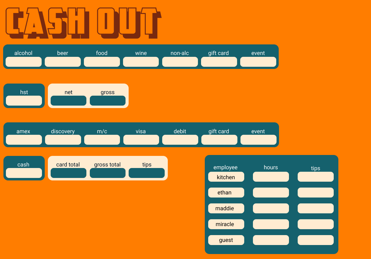
Cash Out app overview showing sales categories, payment types, totals, and staff tip rows

Designing for how the job actually works

The reconciliation math needed to happen the moment someone typed a number, not after they hit submit. The app totals sales and payments live and flags the variance as soon as cash counted stops matching what the sales say it should be.

The tip split follows the bar's actual policy: pull 3% of gross off the top for the kitchen, then divide what's left across staff by hours worked. That is two calculations a person used to do by hand, now computed the instant hours get entered.

Staff names get locked to whoever is actually on the schedule, with one open slot for a guest bartender. On a shared iPad passed between three people a night, one mistyped name can split that person's tips out of the pool entirely because the sheet no longer recognizes them. Locking the regular names down closed that hole without losing flexibility for a fill-in.

The original plan had an AM/PM toggle, carried over from the Figma mock. Once I built it, it was clear that field mapped to nothing: Bar Mini cashes out once a night, full stop. I pulled the toggle rather than keep a control on screen that did not correspond to how the bar runs. The form also clears itself after a successful submit, so the next bartender never inherits last night's numbers.
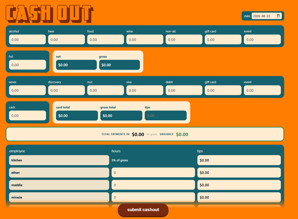
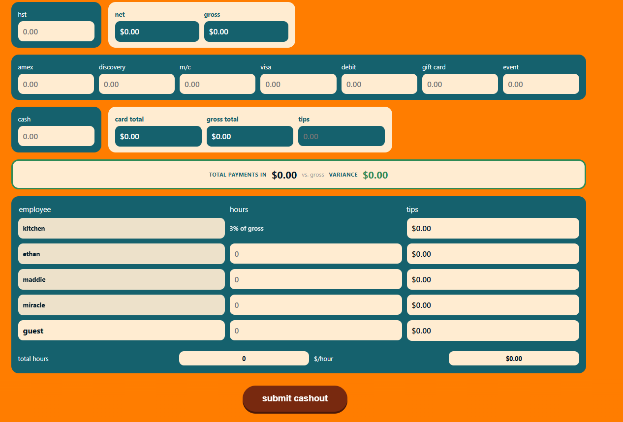
Cash Out form showing a dated shift with sales, payment, and employee fields Cash Out form showing live totals, variance check, and tip pool calculations

Iterating against real feedback

The settings screen where you paste the Google Sheets connection URL looked like it worked in every test, right up until it did not save anything on the actual iPad. The button was closing the dialog, but the save handler was attached to the wrong element. It only showed up once someone tried it on the real device.

A worse one: the locked employee names rendered in white text on a cream background. A broader style rule elsewhere in the stylesheet was overriding the label style, and it became obvious only on the actual screen. I also rebuilt the tip pool write logic after a guessed layout put submissions at the bottom of the Tip Sheet instead of in its fixed formatted block.

The offline cache nearly undid a fix before it shipped. It was pinned to a version name that never changed, so installed devices kept serving the old broken version. I now bump that version number with every release.

Building it

The backend is a Google Apps Script Web App instead of a database. It writes straight into the same two Google Sheets the bar already uses, so nobody has to learn a new system. The write logic checks each target cell first and skips it if a formula is already there, which lets the app add numbers without overwriting the sheet's own math.

It is packaged as a Progressive Web App, so it installs to the iPad's home screen and keeps working through a dead wifi patch, queuing a failed submit locally and retrying automatically when the connection returns. It is deployed through GitHub to Vercel, so a fix goes from my end to the bar's iPad in about a minute.

Cash Out app installed as a shift closeout form on an iPad-sized screen

What this project is, for me

The parts that mattered were not the syntax. They were deciding what should be locked down versus left open on a shared device, when to compute something automatically instead of trusting a person to do the math at 2am, and when to say no to a feature, like direct receipt printing, because the actual infrastructure did not support it cleanly. Those are product decisions before they are code. I just happen to also be the one who builds and ships the result.
Count 'Em! — Bar Inventory App

A case study in designing for the job I actually do

Date
2026
Role
Design and build, solo
Tools
Figma, React, Tailwind CSS, Vite
Where it lives
A shared iPad behind the bar

The short version

I run bar operations for a living, and the daily mess of it is what this app comes from. Staff count stock from memory, someone guesses at an order, and the bar either runs dry mid-shift or calls a distributor for six bottles nobody needed. Count 'Em! is my answer to that, and it's the clearest example I have of how I approach design.

I started in Figma, working out how staff actually move through a count: group by department first, then by distributor, because that's the order someone thinks in while staring at a shelf. Liquor and wine run on par math, so the app calculates what to reorder on its own. Kitchen stock doesn't behave the same way, so that list runs off a manual check instead. I added a confirm step before clearing an order too, because a shared iPad behind a bar gets bumped, and an accidental tap shouldn't wipe out somebody's real order.

Then I built it: a React PWA that lives on that iPad, works without wifi, and matches the brand down to the exact colors and the custom typeface from the Figma file. It came from years of closing a bar and filling out count sheets by hand, the kind of hands-on knowledge I want to keep using in design work aimed at problems that aren't only mine to fix.

The problem

I've managed bars for over ten years, and the stock count never works the way people plan for it to work. Someone counts from memory instead of the shelf. An order gets guessed instead of calculated. The bar runs dry mid-shift, or a distributor gets a call for six bottles nobody needed. Every fix I'd seen for this was a spreadsheet nobody opens, or inventory software built for a warehouse and not a bar with two coolers and one iPad taped behind the register.

So I designed and built the tool myself. Partly to fix a real problem at Bar Mini. Partly to prove I could carry a project from a rough idea through to something people use.

Starting point

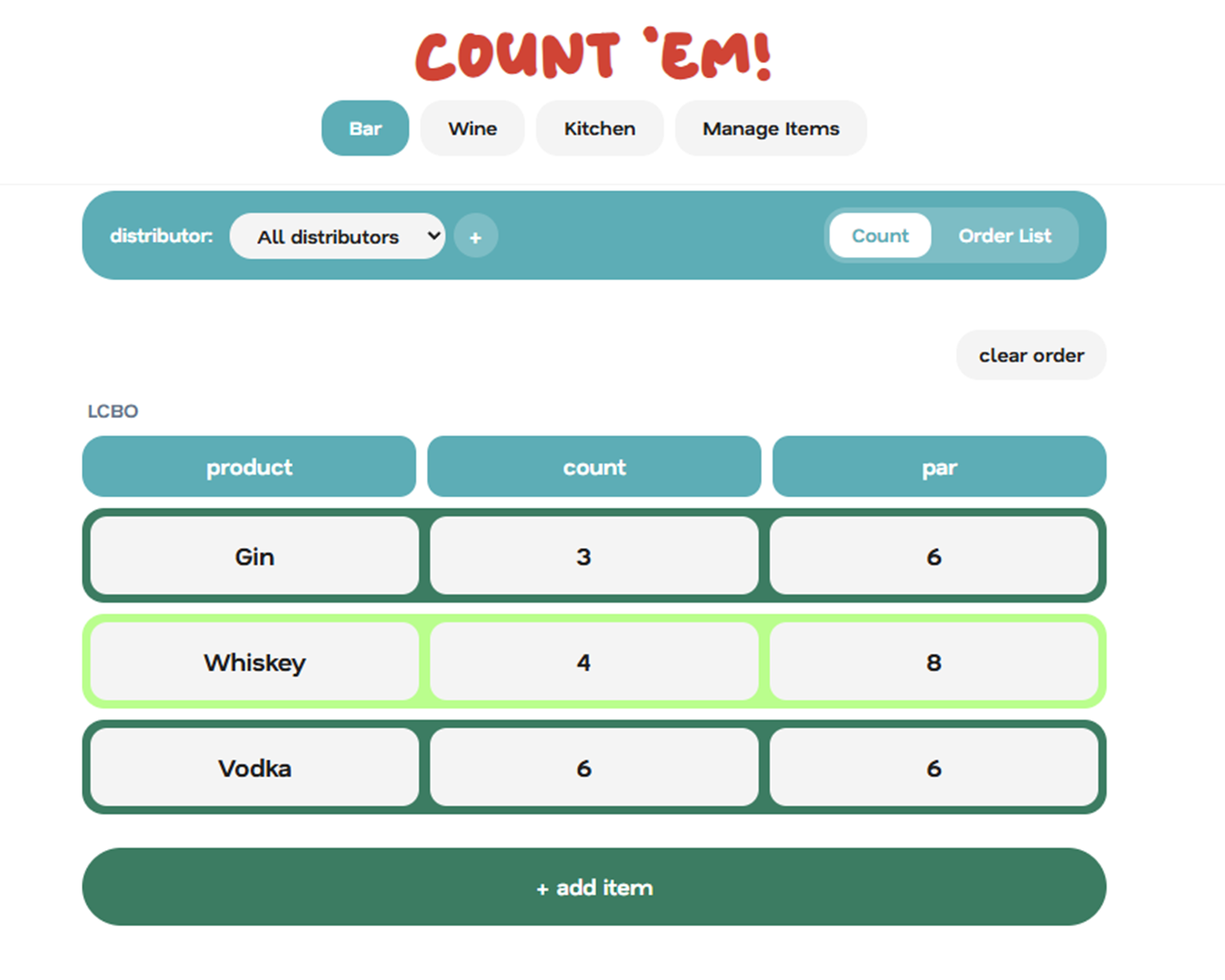
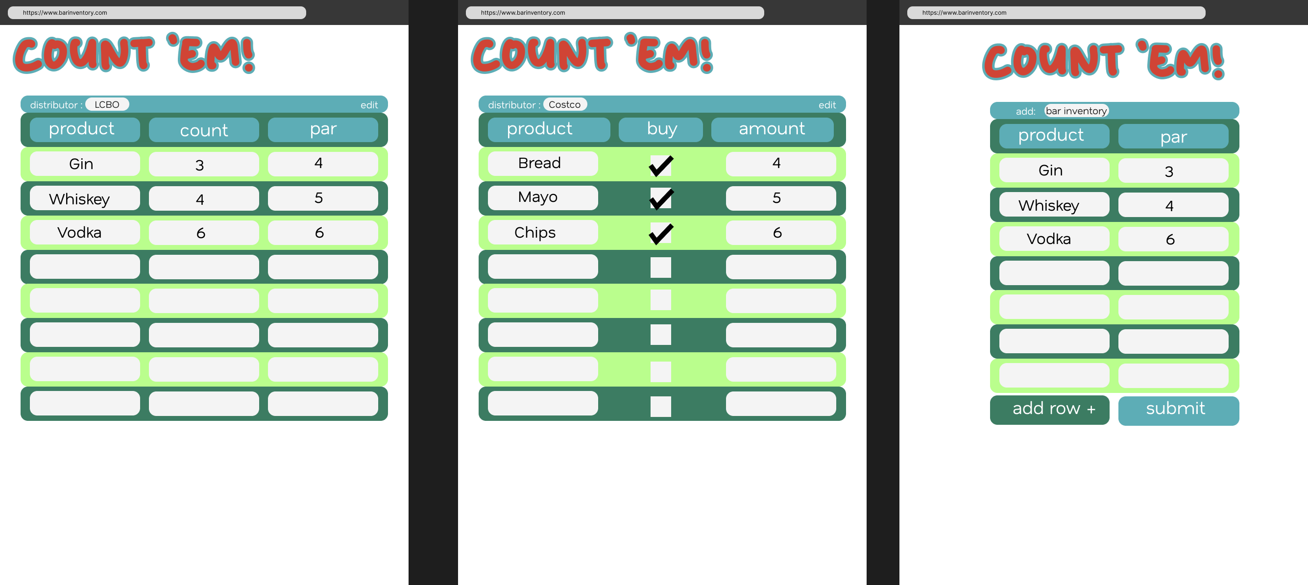
I had a written plan covering what it needed to do and what it would run on, plus a set of screens I mocked up in Figma: a Bar count screen, a Kitchen count screen, an add-item screen. Once the design felt right, I pulled the exact colors, fonts, and spacing straight from that file into the build, so the app matched what I'd designed instead of drifting into a looser version of it. The palette (teal headers, alternating forest-green and lime rows, cream cells) and the title font both came directly out of Figma.

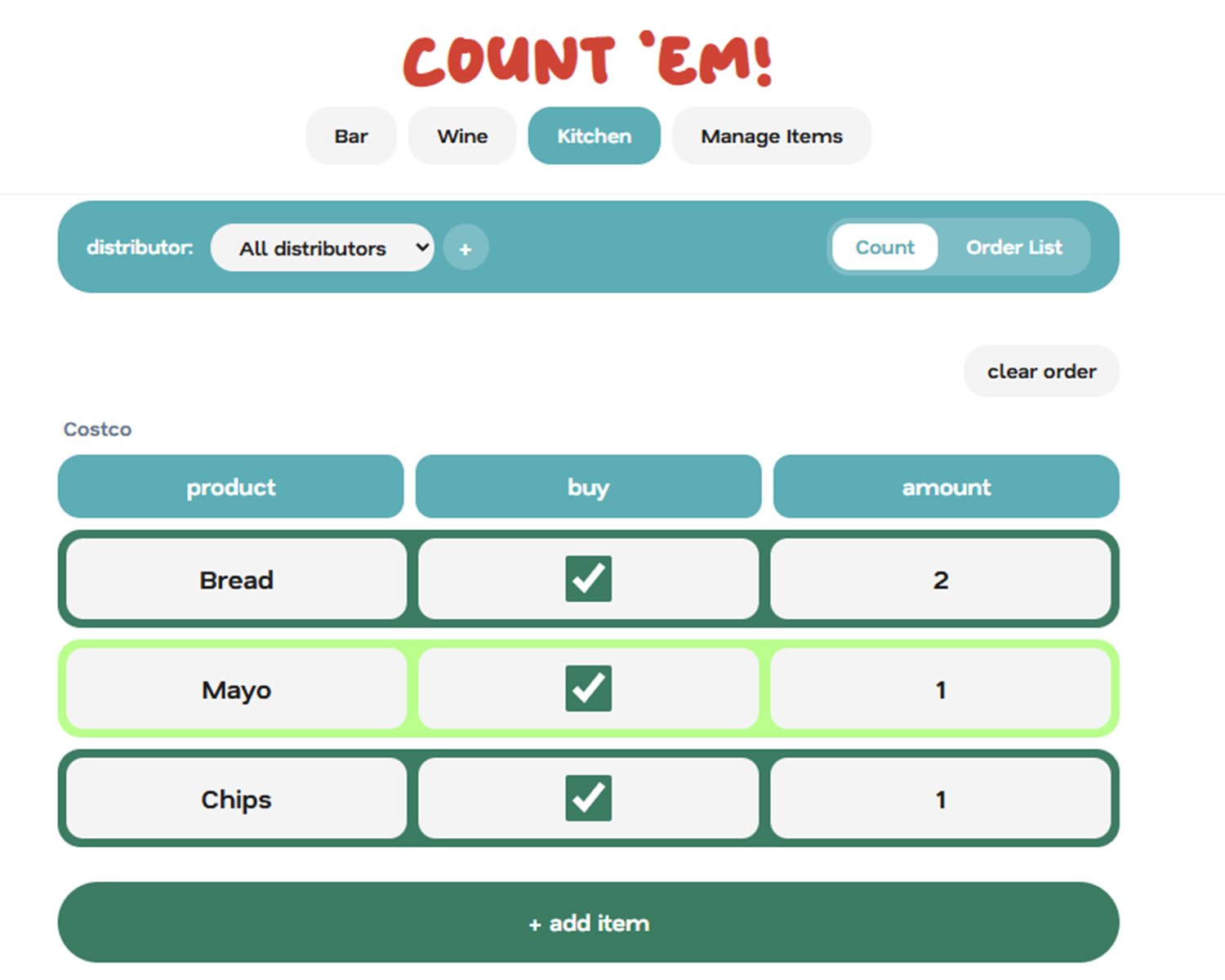
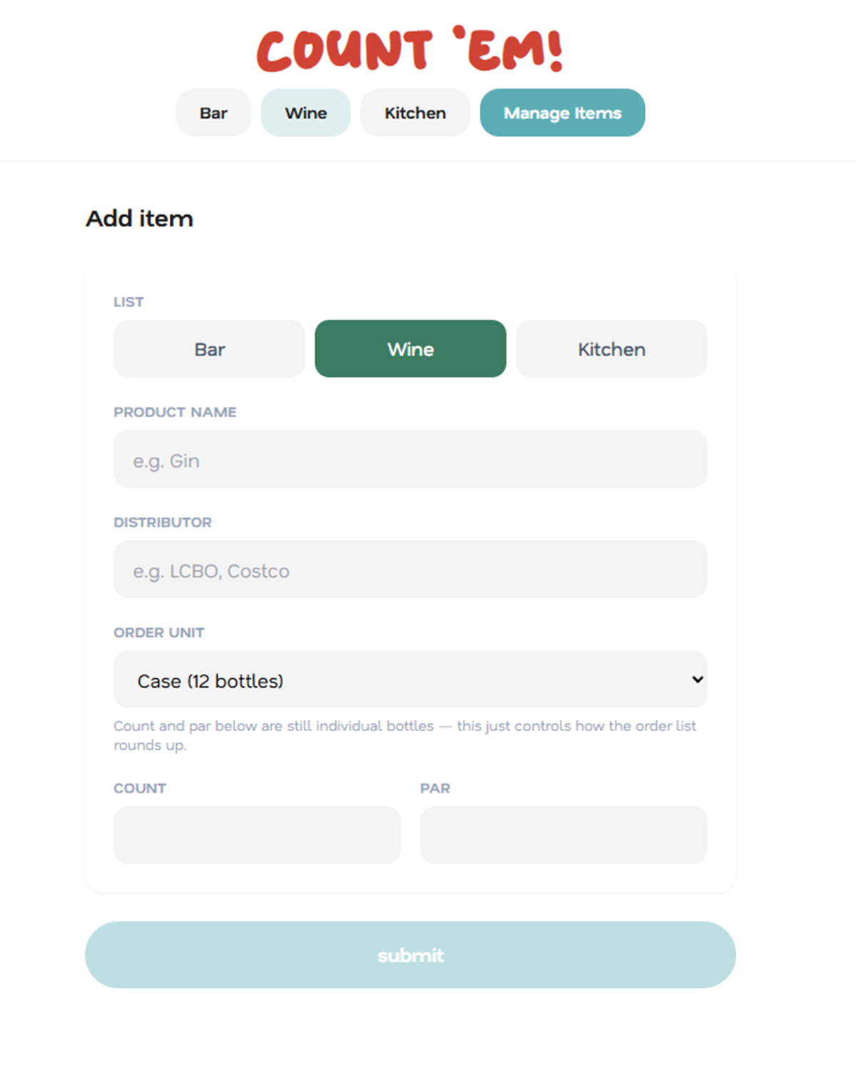
Three screens of the Count 'Em! app: a bar liquor count with product, count, and par columns; a Costco kitchen buy-check list; and a form for adding a new inventory item

Designing for how the job actually works

The Figma mock got the visual language right, but it only showed three static screens. Getting from that to something a bartender would reach for mid-shift meant answering questions the mock never touched.

A bar counts liquor differently from how a kitchen counts pantry stock, and the two get ordered from different distributors entirely. So I split the app into separate lists by department, Bar, Wine, Kitchen, and gave each one a distributor dropdown, so staff could focus on everything from one supplier without wading through someone else's order.

Liquor and wine also run on a different kind of math than pantry stock does. Set a target count for a bottle of gin, and the app calculates what to order based on how far the current count has fallen below it. Nobody keeps six spare cases of mayo the same way, so the Kitchen list runs on a manual buy-checkbox instead. Same app, two logic paths, because forcing one pattern onto both would have made one of them wrong.

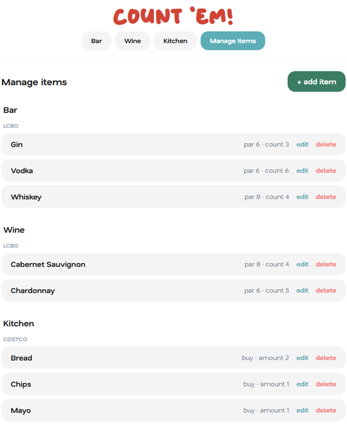
Counting and managing turned out to be different jobs, too. My first pass let you edit or delete an item straight from the count screen, which on a shared device is a mistake waiting to happen. Updating a number is a daily task. Changing a par level or deleting a discontinued item isn't. I pulled edit and delete off the count screen entirely and moved them to a dedicated Manage Items page, so the count screen only does the one thing it's for.

An iPad behind a bar gets bumped, spilled near, and passed between three bartenders in a night, so I built in guardrails for that: a confirm step before clearing an order, and a passcode gate before the app opens at all. Both exist to stop an accidental tap or a stranger from undoing work nobody meant to undo.

Wine needed its own fix. Staff count it bottle by bottle, but distributors sell it by the case or half-case. Instead of making anyone do that conversion by hand, the order list turns a bottle shortfall into whole cases automatically, rounded up, so what shows up on screen is exactly what you'd say out loud on the phone to a rep.

Manage items screen listing Bar, Wine, and Kitchen products grouped by distributor Bar count screen showing LCBO liquor products with count and par columns Kitchen buy-check screen showing Costco items with checkboxes and order amounts

Iterating against real feedback

None of this shipped right on the first try, which is the actual point of building it this way instead of locking in a spec upfront and hoping it holds. The distributor selector originally defaulted to whichever name came first alphabetically, so opening the app usually showed the wrong list. I changed the default to "show everything," grouped by distributor, since that's what I actually wanted to see the moment the app opened. A layout fix to line up a toolbar with the nav buttons above it took two passes: the first attempt just shrank the bar down to fit its own contents, which isn't the same as matching the nav's actual width, so I went back and measured it properly the second time. Ship it, use it myself for a shift, find the thing that's still annoying, fix it. That loop ran the whole build.

Building it

I built the app in React, styled it with Tailwind to match the Figma spec directly, and packaged it as a Progressive Web App, so it installs on an iPad's home screen and keeps working without wifi. That matters in a room with thick concrete walls and inconsistent internet. Data lives in the browser's local storage instead of a database, so there's no backend and no server bill, just a shared passcode standing in for a login system. That fits the actual scale of the problem: one bar, one shared device, not a multi-location system that doesn't exist yet.

It's deployed through GitHub and Vercel, so every update pushes live automatically. It's ready to install on the bar's iPad the same way any bartender would install it themselves.

Add item form for the Wine list, including product name, distributor, and order unit fields

What this project is, for me

This wasn't a coding exercise I happened to design first. The decisions that mattered, how to group information, when to automate a calculation instead of asking a person to make a judgment call, where to put friction on purpose, are the same decisions a product designer makes on any project. I just also know how to build and ship the thing myself. That's the part I want to keep doing.